by Craixis » Fri Nov 18, 2011 12:12 am
Dim, can I ask you something? Are you using a PC with Windows on it?
If yes:
Then you're a hypocrite, because Mac was the first to design a GUI (Graphical User Interface). Do you know what a GUI is? A GUI is the whole reason we're able to game on a computer, before the GUI came along, everything was done in "Command Line", or nothing but text on a screen and keyboard commands. Then Apple came along and released the Apple 2, which was the first computer to use a Graphical User Interface (which Microsoft then copied for Windows).
If no:
Then why are you using a Mac? You're not in the business of design, so you obviously don't understand that it's common for companies to copy successful interface layouts and to try and improve on them. It's the nature of design, you look at the assembly line. According to your logic, no one should've used it outside of Ford, or changed it. Hell, even Edison and the Lightbulb, we shouldn't of even thought about reusing the working elements of the lightbulb and try to improve upon it, I mean, someone designed it first, why even bother dealing with it?
For the interface, it's the same argument, you know how many FPS games have very similar layouts, outside of a small graphical change to fit the art style (which I'll argue again, CtCTD had the monster sprites that look almost exactly like the models their using now, they fit better on a vector background, which may had been suggested and which may be the reason for the massive change). You notice that the layout still matches their previous games, however. The only thing that "copies" KR is that they created a colour palette that was similar to KR's style (again, they art style they're using is based off of the Villain Sprites of CtCTD, look at them, they're almost identical except one is pixelated while the other is vector).
Let's take a look at both interfaces:
Opening Screens: Completely different, I see no similarities.
Colour choices for Background image: Different (N2 is Darker, more Gloomy)
Button Layout: Completely Different, N2 has more options on the opening Screen and all the buttons are on the main menu
Login Screen: N2 covers the whole screen and moved the background image to the right (you notice the Orc's in the middle now instead of on the left, but they walled off the sides with wood for the game saves)
Buttons: Buttons have similar shading on the inside, which is a common illusion used by many interface designers, different colour scheme and text choice, again, different.
Map Screens:
Just from opening, They have buttons on the bottom, only thing similar (KR has strict maplike colors outside of flags, N2 has color for places on the map, their Flags area a different style) Upgrade Screens are completely different, not gonna bother opening them.
In game interface: Again, nothing similar, backgrounds in both games changes constantly depending on location, you are bound to have some colour match ups just through chance (there are only so many ways you can make a "happy forest").
Text choice and button design are different. Layout for interface, different (Look at them, what is similar outside "the art style is minimalist vector", which if you look at N2, their is still focusing on more details. The trees are more detailed, the buildings are more detailed, the units... again, more detailed. KR gave up extreme detail for a cartoonier look, while N2 is cartoony, it's still much more detailed then KR's units).
Wait, so what are you complaining about? Their colours are similar near the end of the game, is that it? Really? Because if you actually LOOK at the styles, you'll see major differences not only in how they choose to layout the game, but also navigation, the details they put into their sprites, and the style they choose to use (which, once again, comes from CtCTD).
They're both Vector Interfaces, that's the only thing that Toge did to make it similar KR, and even then they went a different direction (instead of keeping it simple and cute, they went into detail).
Their sprite style resembles more of FF Tactics and the like then KR... Isometric, you can see the "minor" details on their shield (while KR smaller joints and parts are either not showing on the model or faded away), etc. My avatar has a KR style to it, and even then, there are simple design choices that make it different (again, I go into much more detail with my avatar sprite). Just because they're both vector based doesn't mean they're the same, you can't tell me that DBZ and Full Metal Panic are the exact same style (they're both Manga, yeah, but they both have major design differences).
Really, I fail to see what you're arguing about Dim, you're making a fuss over what, a color choice that happened to be similar? The fact that they're both Vector based games? (oh god, it's not like Flash is a vector based program!) N2 is hardly minimalist, look at the models and tell me that's minimalist... actually look (you can see the details on the shield, the wood lines, the tabards are the only thing that lack detail, you look at the Human Knight and you can see the breastplate with a chest outline on it).
I mean, I would like to have that kind've motivation, but really... What are you so worked up about?
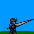
I r Flash doodler.


